![[sticky entry]](http://www.dreamwidth.org/img/silk/entry/sticky_entry.png)
If you'd like to request for a particular theme (i.e. color, feeling, purpose -- some general or broad descriptions of a design you'd like to use for your journal), please comment on this post with your request.
I can't promise to accommodate all requests, but it might push me to a direction towards themes that people like.
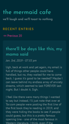
Style 9 - Summer Night
Jan. 13th, 2019 10:32 am![[personal profile]](https://www.dreamwidth.org/img/silk/identity/user.png) tickletheory
tickletheory
Another dark (but not too dark) alternative to my lighter floral themes. I've gone back to using Plain Tabula Rasa as a base theme because it's still the lightest among all that I've tried. This is also the most lightweight among the 4 floral themes.
Huhuhu. Can't wait for the meta viewport tag fix in the future.
If you have theme requests, you can comment here.
Background from rawpixel.com / Freepik
Features: mobile-friendly; designed for mobile, tablet, and desktop. Works with 2 or 3 column page setups.
( Instructions and code below the cut )
Style 8 - Midnight Blooms
Jan. 12th, 2019 08:24 pmtickletheory
I've always wanted to create a dark floral theme for those who prefer dark over my lighter floral themes.
If you have theme requests, you can comment here.
Background from rawpixel.com / Freepik
Features: mobile-friendly; designed for mobile, tablet, and desktop.
( Instructions and code below the cut )
Style 7 - Autumn is Blue
Jan. 8th, 2019 08:10 amtickletheory
I liked the brittle base style after doing the Editor theme because it was quite light compared to some others. I've always wanted to do a blue version of Spring is Pink especially for those looking for a light theme.
This is my most polished mobile layout to date.
Background by rawpixel.com / Freepik
Features: mobile-friendly; designed for mobile, tablet, and desktop.
( Instructions and code below the cut )
Style 6 - Editor (Monokai Classic)
Jan. 6th, 2019 01:07 pmtickletheory
Requested by
octahedrite. Based on the classic Monokai palette by Wimer Hazenberg. Features: mobile-friendly; designed for mobile, tablet, and desktop.
( Instructions and code below the cut )
Style 5 - Spring is Pink
Jan. 5th, 2019 11:43 amtickletheoryTwo-column right
Two-column left
Single column
Two-column left
Single column
Tried something different and I had a lot of fun with this. Available in 2-column (left, right) and 1-column formats only.
Credit: patterns from Subtle Patterns
Features: mobile-friendly; designed for mobile, tablet, and desktop.
( Instructions and code below the cut )
tickletheoryI was trying to resolve my media query / mobile responsive problem and ended up exploring custom S2 layouts / layers / themes. This is really too complicated for most people. I want good design to be more accessible, so I will stop here for now.
I'm putting it up here while I go back to my previous posts and clean them up. (EDIT: Previous themes have been cleaned.)
This style uses custom layers and themes. This also works well on both DESKTOP and MOBILE.
PREVIEW:
This is similar to my previous theme, Style 3 - Text-only (Solarized Dark) but this is based on Trifecta instead of Tabula Rasa.
( Instructions and code under the cut )
Responsive design issues
Jan. 4th, 2019 11:11 amtickletheoryI'm trying to work out an issue with Dreamwidth stripping the viewport meta tag when a theme is NOT using the layout's default stylesheet. I do this to avoid repeating CSS, keeping it a bit more lightweight, even if it means 9k bytes less to load.
I've posted this question on![[community profile]](https://www.dreamwidth.org/img/silk/identity/community.png) style_system. If there's no resolution for this, uh, I'll have to re-evaluate my approach. Duplicated css but responsive > lighter, no duplication css but not mobile responsive? Argh. So frustrating.
style_system. If there's no resolution for this, uh, I'll have to re-evaluate my approach. Duplicated css but responsive > lighter, no duplication css but not mobile responsive? Argh. So frustrating.
Whatever the outcome, I'll have to eventually go back to the themes I've posted here because they are already responsive. The absence of the meta tag just keeps it from triggering. :
I've posted this question on
style_system. If there's no resolution for this, uh, I'll have to re-evaluate my approach. Duplicated css but responsive > lighter, no duplication css but not mobile responsive? Argh. So frustrating. Whatever the outcome, I'll have to eventually go back to the themes I've posted here because they are already responsive. The absence of the meta tag just keeps it from triggering. :
Style 3 - Text-only (Solarized Dark)
Jan. 3rd, 2019 09:03 pmtickletheory
This is based on Solarized by Ethan Schoonover, and uses 7 out of the 16 colors in the palette. This is a dark version of the other theme Text-only (Light).
( Instructions and code below the cut )
Style 1 - Pastel Headers
Jan. 3rd, 2019 01:23 amtickletheory
The header changes colors if you're using "My Styles" in the Display Settings.
( Instructions and code below the cut )